Interpreting a Graph
Interpreting a graph begins with a search for patterns or trends in the plotted data points. Is there a general upward trend of the points, or is there a general downward trend? Do the data points go upwards and then level off, or do they gradually increase to a peak and then begin to gradually decrease? These are helpful questions to think about when interpreting a graph.
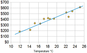
After identifying the pattern, try to draw a line that best fits that trend. This cannot be just a zigzag line that connects all the points. This line should show the general trend of the data, the best-fit line.
After identifying the pattern, try to draw a line that best fits that trend. This cannot be just a zigzag line that connects all the points. This line should show the general trend of the data, the best-fit line.
Drawing a Best-Fit Line
There are two rules for constructing a best-fit line:
- The line should be a straight line or smooth curve to show the trend in the data. Again, this cannot be a zigzag line. Zigzag lines do not show any patterns or trends, they just connect the dots.
- The line should be drawn so that about half the points end up on one side of the line and half are on the other side. Some points may even be on the line.
Writing a Statement of Relationship
After drawing the best-fit line, we need to write a statement describing the relationship of the variables. The following format is one procedure used when writing a statement of relationship between two variables:
As the _______________________ ______________________________,
(independent variable) (describe how it was changed)
the ________________________ ______________________________.
(dependent variable) (describe how it changed)
As the _______________________ ______________________________,
(independent variable) (describe how it was changed)
the ________________________ ______________________________.
(dependent variable) (describe how it changed)
